


The challenge: Craft three dynamic concepts for the Orboost Exhibition Centre Rebrand
Their goal: To become a premier regional venue for arts and culture activities.
My mission: Infuse a modern aesthetic while honouring their cherished community values.
My mission: Infuse a modern aesthetic while honouring their cherished community values.
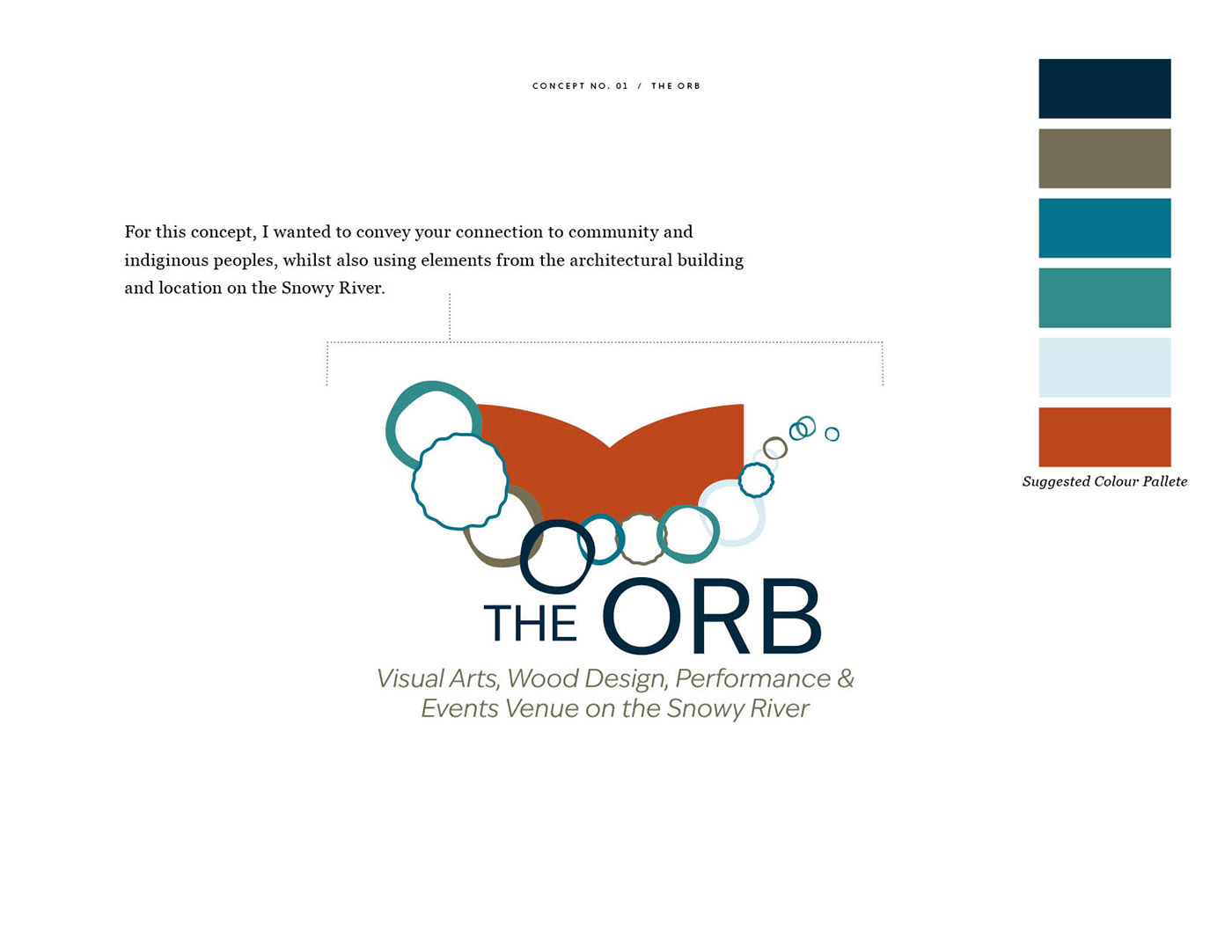
Concept 1 was using the potential name change of "The Orb".
Here I chose to create unique circle elements connecting together that were inspired by an indigenous painting about connection to country and community. The font choice of 'Ivy Epic Variable', is clean and modern, whilst feeling friendly and welcoming due to its low contrast. It is also available in a large font family for versatility as a brand font.
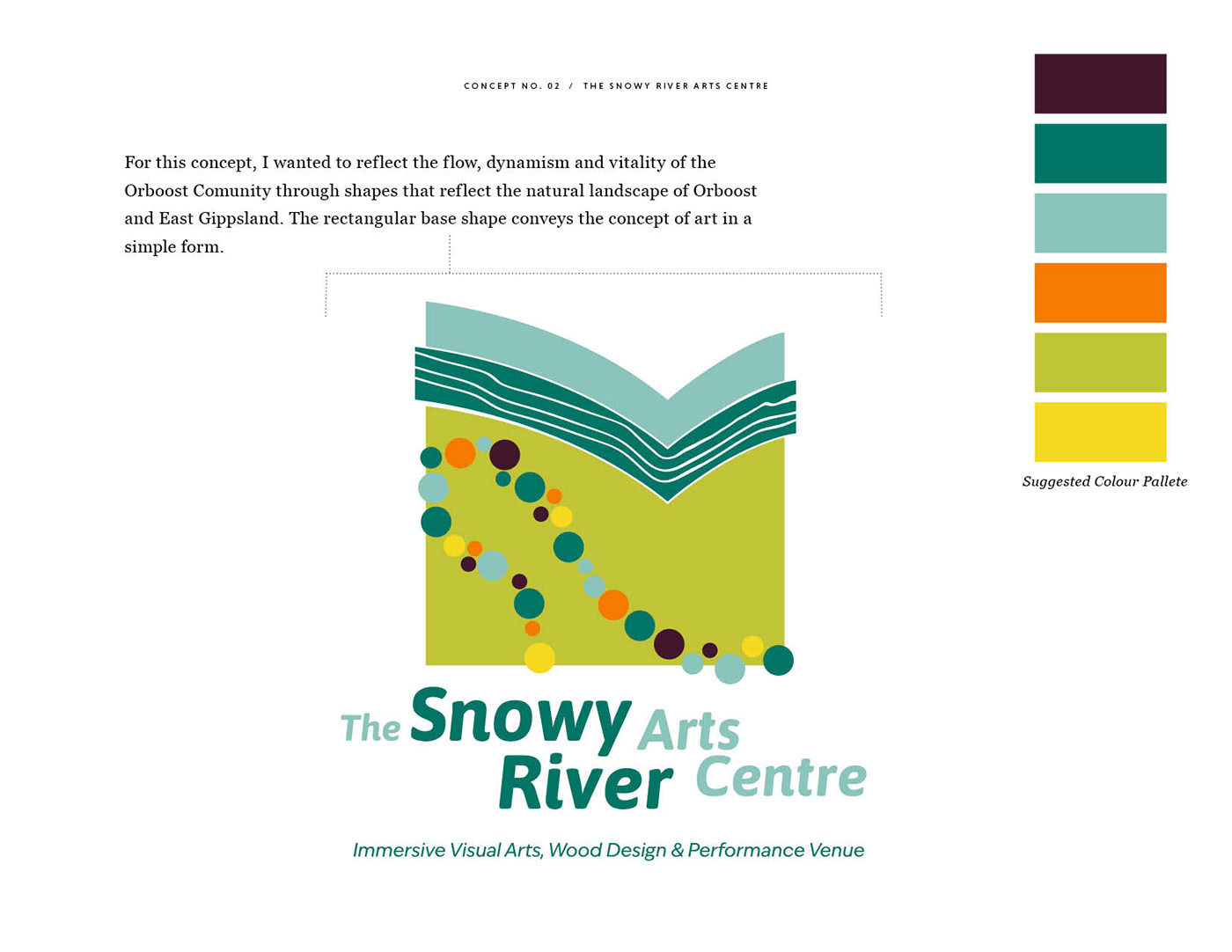
Concept 2. Name: The Snow River Arts Centre
The arch shapes were inspired by the architecture of the building, specifically the metal structures at the entrance. These are also reminiscent of rolling hills, with the hand drawn lines representative of the dense forest in the area.
The shape of the river as it meets Orboost is refected in the circle shape. The pattern also references the many different individuals working together to build community.

Concept 3. Name: The OX
The design is abstracted to capture the essence of the beautiful building design in a 3D inspired design. I have included a wood grain pattern, so as to convey the significance of wood design to the venue.
The font choice of 'EB Garamond', conveys the significance of the history behind the Orboost Exhibition Centre through its formal look, whilst maintaining a soft and friendly appeal. The font juxtaposes the sharp lines in this design.

